Alpine Scrapbook: Increasing Natural Light
I grew up in a north facing home, and lived in a range of properties with different aspects but fell in love with the benefits of being south facing. So much so that I listed this as one of the most important criteria when we started our property search in Cornwall. Alpine, the project we moved into in 2020 however is a north facing property. Fortunately the garden is deep enough not to be in shadow of the house, it’s only the space immediately outside the back that’s shaded (something we appreciate on a hot day). When we started planning the work we would do here, increasing natural light was a priority.
Having spent a year getting to know the house before we met with an architect, I understood the darker areas and where we could easily get more benefit from the sun by carefully placing the windows. This blog will be a scrapbook of decisions at Alpine, commenting on some of the windows we removed and relocated in the existing part of the house, and some that we added within the extension, hopefully it gives you some ideas for your project and confidence not to be daunted about moving a window (or a whole room within you home)!
Before I begin, I’ll summarise a few decisions we made from our year getting to know the light:
We quickly decided to move the kitchen to the front of the house as this gets the most sunlight.
The original kitchen was dark, and with an extension on this side, would become darker so its use needed to be a functional room not a place to be (such as storage space/ a utility/boot room).
We wanted to bring front aspect light into another bedroom so we needed to move a window, this would then give us more scope on the outside of the original footprint with the depth of the extension.
With a bungalow, it’s often the case that the centre can be difficult to light with a window, for us this is a bathroom. However having lived in a bungalow before where we removed a bathroom window, we weren’t fazed by this. If we choose to there’s the option of adding a sun tunnel, but I don’t particularly like these, so I plan to use other design tricks here!
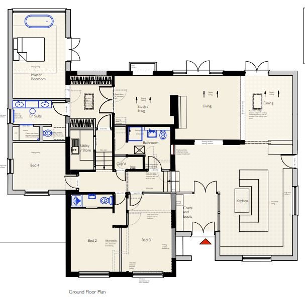
Some changes to the above plan were made but this may help orient yourself!
Original Kitchen
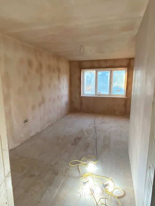
Let’s start with an easy one, the original kitchen was so dark and whilst it had two windows we always needed the lights on and even that didn’t feel enough sometimes (it was teak so that didn’t help). This photo was taken in the middle of the day in summer, yet we needed lights, it really felt cave like. Whatever this corner of the footprint would be, I knew it wasn’t somewhere we would choose to spend a lot of time so it was labelled as an area on the plan for ‘function’. As our vision developed to extend on each side of the existing house, we chose to loose this side facing window all together and split this room into a laundry room, wardrobe and a secondary route through the house/a short cut from our future bedroom to the other three bedrooms. There is still a window which looks out to the garden.
New Kitchen
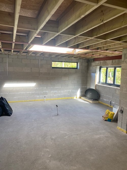
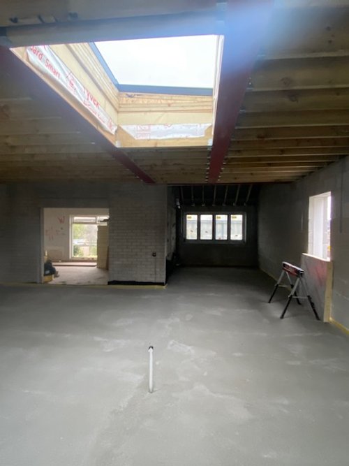
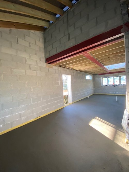
Relocating the new kitchen to the front of the house presented three options, either within the existing footprint by knocking two bedrooms together, or within either side extension. We had more width to one side so this strongly ruled that in. By doing this our entry would immediately be a view through the house to the garden which was the very first point on our design brief. Win win. When it came to benefitting from the light it was an easy decision to not divide front to back so that light could travel through, therefore dictating a broken-open plan footprint, it also gave us dual aspect windows. Another layer to drenching the kitchen with more light was the addition of a 2m x 1.2m sky light in the centre of this area, I can’t wait to sit under this and appreciate the glow. The final window in our kitchen is my favourite. It was a design decision that I mulled over from all angles, and remember on a chilly day, setting out the height with the builders. It’s a slither of joy which faces the sunrise and palm trees on the boundary between our neighbours, and beyond that, on the horizon is the sea. In winter, when the sun is low there is a gorgeous pink hue as the sun creeps up behind Gribbin Head, and recently I’ve noticed the pocket of light it disperses in the furthest corner of the kitchen where we’ll eventually have a comfy chair, perfect for reading!
Living Room
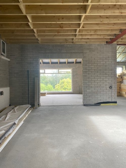
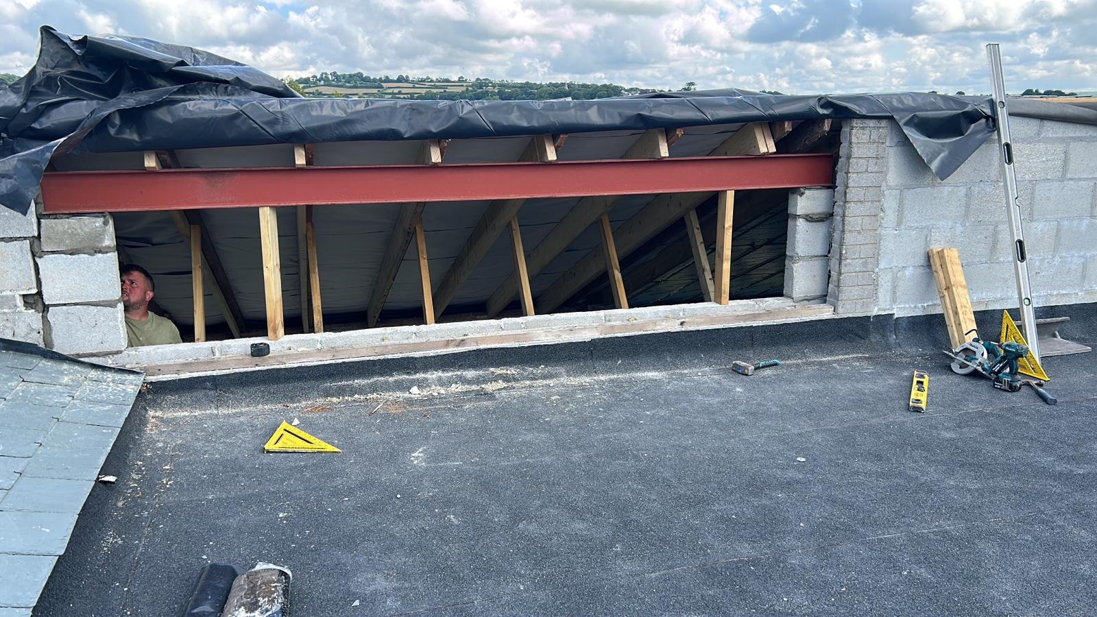
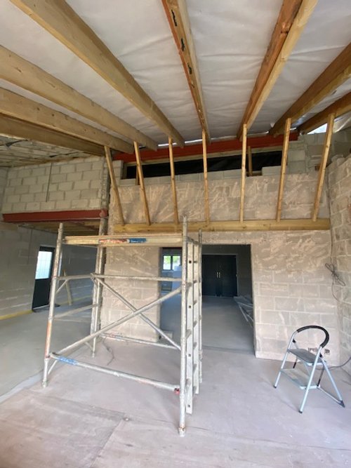
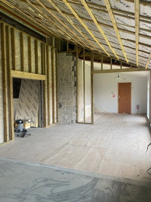
Our living, dining and snug are a trio of connecting, semi-open plan ‘rooms’ across the back of our home, they all have views of the garden and are therefore furthest north. Trying to bring light from the front to the back can create a dark tunnel, however in keeping our layout mostly open by taking out the original side wall and taking out the original patio doors to create an opening, we borrow light from the kitchen. However, to add an extra stream of sun, and because we already had a vaulted roof, we could raise the internal ceiling to finish above the new extension flat roof and add a 3m slice of daylight from the south. A beauty! We considered adding Velux windows, but these would face north, and I was concerned how downward light would cast on the TV, so the clerestory window was the best solution for our circumstances.
In the house before the work, there was a door sized window facing our neighbours, you can see this on the plan above, we felt happy losing this window on the east facing wall as it would be closer to the boundary and also restrict furniture options.
This window is currently covered in tarpaulin until we’ve done the cladding and lead work, but I can’t wait to see it properly revealed!
Original Bedroom
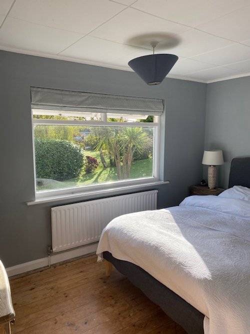
Once we decided that the two front bedrooms wouldn’t be used as a kitchen, we made layout adjustments to make them more functionable. One bedroom had a front facing window which was glorious from around 11am to 5pm. The other had a side facing window (towards the neighbours palm trees and the sea), but we’d decided to build the kitchen in this space. It was a necessity to move the window to the front, which we could plan for in the layout, therefore filling the room throughout the day. It was a bonus that this gave more symmetry from the outside too.
Natural light is a foundation to a stunning execution of a design. It should inform your decisions on wall colours, layout, function, heating and materials. I always reccomend and frequently remind renovators to take time tracking and recording natural light before making any significant or costly changes. Without this research at Alpine, we wouldn’t have made decisions that shape where those glorious pools of light land. Take your time, think outside the box and maximise where you can - you won’t regret it!
In our living and snug we made two more window choices…but I’ll update you on that in an upcoming blog, Managing Project Delays, I can also feel a blog on window dressings coming on!
Happy planning and renovating!
If there’s a specific query or subject you would like me to write about drop me a message, and if you need help, I’m always happy to schedule a call.

